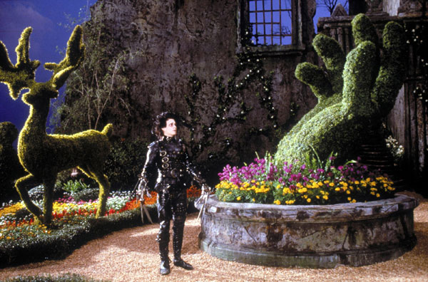
Edward Scissorhands is one of the best films to show the use of colour correction. Tim Burton’s iconic use of German Expressionism is very successful in this motion picture. He separates Edward with the village by having one very desaturated and the other brightly coloured and inviting. The design of Edward’s character, right down to the pasty colour of his skin, is mirrored in the style and colour flow of his abandoned majestical mansion that lives isolated, at what seems to be the never ending road connected to the contrasting suburban street. The jagged exaggerated edges of Edward Scissorhands’ habitat are an immense contrast to the straight clean cut edges of “Pleasantville”.
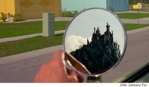
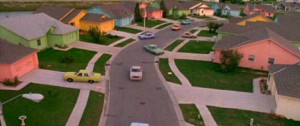
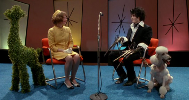
Edward’s move from his abode into the unknown is greatly composed to show us just how different he is to what Tim Burton wants us to think is normal. Burton does this by continuing the lack of colour scheme for Edward especially when he is among the ‘normal’.
Even though Burton shows us how hugely different these two worlds are he ends the film in a brilliant way. He still demonstrations the dark and hollow world that Edward has known for nearly all of his existence but fills some of it with colourful flowers to symbolise the change his love interest, Kim, has done to him. It’s a small but powerful representation of how the two worlds have overlapped.